Creating a website these days is easy and does not require coding knowledge. However, you may want to create a website from scratch with Hypertext Markup Language (HTML). Although it is more difficult, HTML websites are more flexible and faster because they require fewer resources to run.
After being handy with HTML, one proceeds to the next step of learning, which is CSS. The modern-day webpages are robust and made of advanced technology. Therefore, the question here is – Is How To Create A Website Using HTML And CSS?
Don’t Miss: How To Start A Blog In Google Blogger Blog 2023
What is a website using HTML and CSS?
A website created using HTML and CSS is a combination of two fundamental technologies for building and designing web pages. Let’s break down their roles and how they work together:
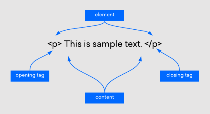
1] HTML (Hypertext Markup Language): HTML is the backbone of a web page. It provides the structure and content of the page. HTML uses various tags and elements to define different components of a web page, such as text, headings, paragraphs, lists, links, images, forms, and more. HTML elements are used to create the basic structure of a webpage, like defining the header, navigation, main content, and footer.
Example HTML code for a simple webpage structure:
<!DOCTYPE html>
<html>
<head>
<title>My Website</title>
</head>
<body>
<header>
<h1>Welcome to My Website</h1>
</header>
<nav>
<ul>
<li><a href=”#”>Home</a></li>
<li><a href=”#”>About</a></li>
<li><a href=”#”>Contact</a></li>
</ul>
</nav>
<main>
<p>This is the main content of the website.</p>
</main>
<footer>
<p>© 2023 My Website</p>
</footer>
</body>
</html>
2] CSS (Cascading Style Sheets): CSS is used to control the presentation and styling of a web page. It allows you to define the layout, colors, fonts, spacing, and overall visual appearance of the HTML elements. CSS rules can be applied directly within an HTML document or can be included in separate CSS files that are linked to the HTML.
Example CSS code to style the header and navigation from the HTML example above:
header {
background-color: #333;
color: white;
text-align: center;
padding: 20px;
}nav {
background-color: #444;
padding: 10px;
}nav ul {
list-style: none;
padding: 0;
}nav li {
display: inline;
margin-right: 10px;
}nav a {
text-decoration: none;
color: white;
}
By combining HTML and CSS, web developers can create visually appealing and well-structured websites. HTML defines the content and structure, while CSS defines how that content should be presented. This separation of content and presentation is a fundamental concept in web development, allowing for easier maintenance and consistent design across web pages.
Don’t Miss: How To Create Multiple Authors In Blogger
How To Create A Website Using HTML And CSS
Creating a website using HTML and CSS is a great way to build a simple web page or learn the fundamentals of web development. HTML (Hypertext Markup Language) is used for structuring the content of a web page, while CSS (Cascading Style Sheets) is used for styling and formatting that content. Here’s a step-by-step guide to creating a basic website:
1. Choose an HTML Code Editor
Choosing an HTML code editor with advanced features depends on your specific needs and preferences. Here are a few popular code editors that are commonly used for HTML development, along with some of their key features:
Visual Studio Code (VS Code):
- Free, open-source, and highly customizable.
- Rich extension marketplace, including HTML, CSS, and JavaScript support.
- Integrated Git version control.
- IntelliSense for autocompletion and suggestions.
- Debugging capabilities.
- Lightweight and fast.
- A wide range of community-contributed plugins.
- Multiple cursors for efficient editing.
- Cross-platform support (Windows, macOS, Linux).
- Distraction-free mode for focused coding.
Atom:
- Developed by GitHub and is open-source.
- Highly customizable with themes and packages.
- Built-in package manager.
- Git integration and GitHub integration.
- Smart autocompletion and error checking.
- An open-source code editor made for web development.
- Live Preview for real-time HTML and CSS changes.
- Quick Edit and Quick Docs feature for efficient coding.
- Preprocessor support for LESS and SCSS.
- Extensible with extensions and themes.
- A commercial IDE from JetBrains, designed for web development.
- Intelligent coding assistance for HTML, CSS, and JavaScript.
- Advanced debugging and profiling tools.
- Built-in version control support.
- Integration with popular build tools like Grunt and Gulp.
Eclipse with Web Tools Platform (WTP):
- An open-source IDE often used for Java development but has robust web development tools.
- HTML, CSS, and JavaScript support.
- Extensive plugin ecosystem.
- Integrated Git and other version control systems.
- Cross-platform support.
- A lightweight, free code editor for Windows.
- Syntax highlighting for many programming languages.
- Supports various plugins.
- Regular expression search and replace.
- Multi-view and multi-document editing.
Each of these code editors has its own strengths and may be better suited for different scenarios or personal preferences. You can try a few of them to see which one aligns best with your specific needs and workflow.
2. The Site Layout Plan Depends on Your Niche
Planning a site layout is a crucial step in web development. The site layout includes the structure of your web pages, the arrangement of content, and the navigation. Here’s a step-by-step guide to help you plan a site layout:
1. Define Your Website’s Purpose and Audience:
Start by understanding the purpose of your website and who your target audience is. This information will influence the design and content.
2. Create a Sitemap:
Develop a sitemap to visualize the structure of your website. It’s like an outline of your site, showing how pages are connected.
3. Wireframe the Layout:
Create wireframes or sketches of your web pages. These should outline the placement of key elements such as headers, navigation menus, content sections, and footers. This step helps in the initial design phase.
4. Choose a Layout Style:
Decide on a layout style for your website. Common options include:
- Fixed Layout: Content stays centered and doesn’t change with screen size.
- Fluid Layout: Content expands or contracts to fit the screen size.
- Responsive Layout: Adjusts and restructures content for various screen sizes (recommended for mobile-friendly websites).
5. Plan Navigation:
Create a clear and user-friendly navigation menu. Decide on the menu’s position (e.g., top, side, or hamburger menu for mobile), and determine the menu structure.
6. Content Organization:
Organize your content into logical sections and prioritize what appears on the homepage and secondary pages.
7. Choose Typography and Color Scheme:
Select fonts and a color scheme that aligns with your brand and enhance readability.
8. Consider SEO:
Plan for search engine optimization (SEO) by choosing relevant keywords and structuring your content to be search-engine friendly.
9. Multimedia Elements:
Plan for images, videos, and other multimedia elements. Consider how they’ll be integrated into the layout.
10. Test on Multiple Devices:
Ensure that your site layout looks and functions well on various devices, including desktops, tablets, and smartphones. This is essential for a responsive design.
11. Accessibility Considerations:
Make sure your site is accessible to people with disabilities. Follow web accessibility guidelines and ensure features like alt text for images and proper headings are in place.
12. Footer and Additional Pages:
Plan what you want in the footer (copyright information, contact details, etc.). Consider additional pages like “About Us,” “Contact,” and “Privacy Policy.”
13. Social Media Integration:
Plan how social media links and sharing options will be integrated into the site.
14. Feedback Mechanism:
Decide if you want to include a contact form or other feedback mechanisms.
15. Content Management System (CMS):
Choose a CMS if needed (e.g., WordPress, Drupal, Joomla) and plan how content will be managed and updated.
16. Backups and Security:
Plan for regular backups and implement security measures to protect your website.
17. Review and Iterate:
Review your layout plans and wireframes, and iterate as necessary. Get feedback from others if possible.
18. Develop and Test:
Once your layout plans are finalized, move on to web development. Code your website and thoroughly test it to ensure it works as expected.
Remember that web design is an iterative process, and you may need to make adjustments as you go along. Keep user experience in mind and aim for a clean, intuitive, and visually appealing layout.
3. Enter The HTML Code
Once the tool and layout plan are ready, you can start writing your site’s code. The steps may vary depending on your code editor, but the general idea is similar.
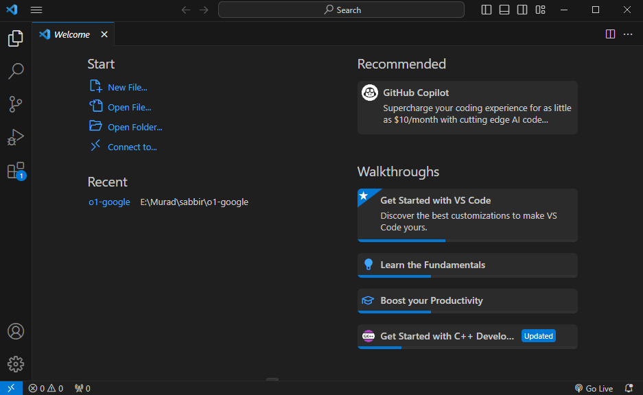
In this tutorial, we will show you how to do it using VSCode:
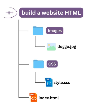
- Create a new folder on your computer. It will be the directory for all of your site’s files.
- Open VSCode → File → Open Folder.
- Locate the new folder and click Select Folder.
- Select New File. Name the file index.html and press enter.
- Click Create File to confirm.
- Once prompted to the index.html editor tab, enter the following basic HTML document structure:
Certainly, here’s a simple example of an HTML code structure for a basic webpage:
<!DOCTYPE html>
<html>
<head>
<meta charset=”UTF-8″>
<meta name=”viewport” content=”width=device-width, initial-scale=1.0″>
<title>Your Website Title</title>
<link rel=”stylesheet” type=”text/css” href=”styles.css”>
</head>
<body>
<header>
<h1>Welcome to My Website</h1>
<nav>
<ul>
<li><a href=”#”>Home</a></li>
<li><a href=”#”>About</a></li>
<li><a href=”#”>Services</a></li>
<li><a href=”#”>Contact</a></li>
</ul>
</nav>
</header><main>
<section>
<h2>About Us</h2>
<p>This is a brief description of our company.</p>
</section><section>
<h2>Our Services</h2>
<ul>
<li>Service 1</li>
<li>Service 2</li>
<li>Service 3</li>
</ul>
</section>
</main><footer>
<p>© 2023 Your Website Name</p>
</footer>
</body>
</html>
In this code:
<!DOCTYPE html>declares the document type.- The
<html>element is the root of your webpage. - The
<head>section contains metadata, such as the character set and the page title. It also links to an external CSS file. - The
<body>element is where you put the visible content of your webpage. - Within the, there’s a
<header>for your site’s header, a<nav>for navigation links, and a<main>section for the main content. - In the main content section, there are two
<section>elements that contain some sample content. - Finally, the
<footer>holds the copyright notice.
This is a basic structure. To style your website, you would also create a separate CSS file (e.g., “styles.css”) and link it to the HTML file as shown above. You can add more content, styles, and functionality as needed for your website.
3. Create Elements In The Layout
Sure, let’s add some common elements to the layout we created earlier. In this example, we’ll include a header with a background image, a content section, and a contact form in the main section. Here’s the updated HTML code with these elements:
<!DOCTYPE html>
<html>
<head>
<meta charset=”UTF-8″>
<meta name=”viewport” content=”width=device-width, initial-scale=1.0″>
<title>Your Website Title</title>
<link rel=”stylesheet” type=”text/css” href=”styles.css”>
</head>
<body>
<header style=”background-image: url(‘header-image.jpg’);”>
<h1>Welcome to My Website</h1>
<nav>
<ul>
<li><a href=”#”>Home</a></li>
<li><a href=”#”>About</a></li>
<li><a href=”#”>Services</a></li>
<li><a href=”#”>Contact</a></li>
</ul>
</nav>
</header><main>
<section>
<h2>About Us</h2>
<p>This is a brief description of our company.</p>
</section><section>
<h2>Contact Us</h2>
<form>
<label for=”name”>Name:</label>
<input type=”text” id=”name” name=”name” required>
<label for=”email”>Email:</label>
<input type=”email” id=”email” name=”email” required>
<label for=”message”>Message:</label>
<textarea id=”message” name=”message” rows=”4″ required></textarea>
<button type=”submit”>Send</button>
</form>
</section>
</main><footer>
<p>© 2023 Your Website Name</p>
</footer>
</body>
</html>
In this updated code:
- We added a background image to the header using inline CSS. You can replace
'header-image.jpg'it with the actual path to your image. - In the “Contact Us” section, we included a simple contact form with fields for name, email, and message, as well as a submit button.
You can further style these elements and adjust their layouts by creating CSS rules in your external CSS file (e.g., “styles.css”). For example, you can control the background image properties, font styles, element positioning, and more through CSS to achieve the desired visual appearance and layout.
Don’t Miss: How to Add an HTML Sitemap Page in Blogger Blog
4. Create Elements By HTML & CSS Layout
Sure, I’ll provide an example of how to create some common elements in an HTML layout along with a simple CSS stylesheet to style them. Here’s an HTML layout with included CSS:
<!DOCTYPE html>
<html>
<head>
<meta charset=”UTF-8″>
<meta name=”viewport” content=”width=device-width, initial-scale=1.0″>
<title>Sample Layout</title>
<link rel=”stylesheet” type=”text/css” href=”styles.css”>
</head>
<body>
<header>
<h1>Welcome to My Website</h1>
<nav>
<ul>
<li><a href=”#”>Home</a></li>
<li><a href=”#”>About</a></li>
<li><a href=”#”>Services</a></li>
<li><a href=”#”>Contact</a></li>
</ul>
</nav>
</header><main>
<section>
<h2>About Us</h2>
<p>This is a brief description of our company.</p>
</section><section>
<h2>Our Services</h2>
<ul>
<li>Service 1</li>
<li>Service 2</li>
<li>Service 3</li>
</ul>
</section>
</main><footer>
<p>© 2023 Your Website Name</p>
</footer>
</body>
</html>
CSS (styles.css):
/* Reset some default browser styles */
body, h1, h2, p, ul, li {
margin: 0;
padding: 0;
}/* Basic styles for the header */
header {
background-color: #333;
color: #fff;
text-align: center;
padding: 10px;
}header h1 {
font-size: 24px;
}nav ul {
list-style: none;
}nav li {
display: inline;
margin-right: 20px;
}nav a {
color: #fff;
text-decoration: none;
}/* Styling the main content */
main {
margin: 20px;
}section {
margin-bottom: 20px;
}h2 {
font-size: 20px;
}/* Styling the footer */
footer {
background-color: #333;
color: #fff;
text-align: center;
padding: 10px;
font-size: 14px;
}
5. Customize Your Site Using HTML and CSS
To customize your website using HTML and CSS, you can make changes to the HTML structure and apply styles using CSS. Here are some common customization tasks you can perform:
1. Change Content:
- Edit the text and content within HTML elements to reflect your website’s information. Update headings, paragraphs, links, and lists as needed.
2. Add Images:
- Insert images into your HTML by using the
<img>tag. For example:
<img src=”image.jpg” alt=”A beautiful image”>
3. Modify Layout:
- Adjust the layout by adding or removing HTML elements. For instance, you can add additional sections or divs to your layout.
4. Apply CSS Styles:
- Customize the appearance of your website by creating or modifying CSS rules in your stylesheet (
styles.cssin the previous example). Here’s how you can customize styles: - Change colors:
body {
background-color: #f2f2f2;
}
- Modify fonts:
h1 {
font-family: ‘Arial’, sans-serif;
}
- Adjust padding and margins:
main {
margin: 30px;
}
- Define sizes:
img {
width: 100%;
max-width: 600px;
}
- Style links:
a {
color: #0077cc;
text-decoration: none;
}a:hover {
text-decoration: underline;
}
5. Create a Responsive Design:
- Use CSS media queries to make your website responsive to different screen sizes. This ensures that your site looks good on both desktop and mobile devices.
@media (max-width: 768px) {
/* Add styles for smaller screens here */
}
6. Add CSS Animations:
- Implement animations to make your website more engaging. You can use CSS animations and transitions to create effects like hover animations, fade-ins, and more.
.box {
transition: background-color 0.5s ease;
}.box:hover {
background-color: #ffcc00;
}
7. Include Custom Fonts:
- Import and use custom fonts in your CSS. Services like Google Fonts and Font Awesome provide a wide variety of fonts and icons.
body {
font-family: ‘Open Sans’, sans-serif;
}
8. Implement JavaScript:
- If you want to add interactive elements to your website, you can incorporate JavaScript for functionality like form validation, image sliders, or dynamic content updates.
Remember to continuously preview your website in a web browser as you make changes to see how the customization looks and behaves. Customization is a creative process, and you can make your site as unique as you’d like based on your design goals and requirements.
How to Create an SEO-Friendly Website
Optimize HTML Structure: Start by structuring your HTML content logically. Use headings (H1, H2, H3, etc.) to organize your content, and make sure your text is easily readable. Search engines favor well-structured, semantic HTML.
Mobile Responsiveness: Ensure your website is responsive and looks great on all devices, from smartphones to desktop computers. Google and other search engines prioritize mobile-friendly sites in their rankings.
Fast Loading Speed: Page loading speed is a crucial SEO factor. Optimize your images, use efficient coding practices, and consider content delivery networks (CDNs) to reduce loading times.
Keyword Research: Identify relevant keywords related to your website’s content. Use tools like Google’s Keyword Planner to find keywords with a good search volume and low competition.
Title Tags and Meta Descriptions: Craft compelling title tags and meta descriptions for each page. These are the first things users see in search results, so make them engaging and relevant to the page’s content.
Clean and Semantic Code: Keep your HTML code clean and well-structured. Use CSS for styling, and minimize the use of inline styles or excessive JavaScript. This helps search engines index your content more effectively.
Alt Text for Images: Don’t forget to add descriptive alt text to your images. Search engines rely on alt text to understand the content of images, and it’s also helpful for users with visual impairments.
Create a Sitemap: A sitemap is an XML file that helps search engines understand the structure of your website. Submit it to search engines like Google to ensure all your pages are indexed.
Build High-Quality Backlinks: Encourage other reputable websites to link to your content. Backlinks are a significant factor in SEO rankings. Create valuable, shareable content to attract natural backlinks.
Regularly Update Content: Fresh, relevant content is essential. Regularly update your website with new information, blog posts, or products to keep visitors engaged and encourage search engines to crawl your site more often.
User Experience Matters: Make sure your website is user-friendly. Easy navigation, clear calls to action, and a pleasing design not only improve SEO but also keep visitors on your site longer.
Conclusion
In conclusion, Create A Website using HTML and CSS is a fundamental skill in web development. HTML provides the structure and content of your web pages, while CSS enables you to style and customize the appearance of your site. Here’s a recap of the key steps:
- Plan Your Website: Start by defining the purpose of your website and creating a sitemap to organize your content.
- Set Up Your Development Environment: You can use a simple text editor or a code editor to create your HTML and CSS files.
- Create HTML Structure: Build the structure of your web pages using HTML elements. Include headers, navigation menus, content sections, and footers.
- Add Content: Populate your web pages with text, images, links, and other elements.
- Style with CSS: Use CSS to customize the appearance of your website. Modify colors, fonts, margins, padding, and more to achieve your desired look.
- Create a Responsive Design: Implement responsive design techniques to ensure your website looks good on various screen sizes.
- Add CSS Animations: Enhance user experience by incorporating CSS animations and transitions.
- Include Custom Fonts: Utilize custom fonts to give your website a unique typographic style.
- Implement JavaScript (Optional): If needed, you can incorporate JavaScript for interactive features and dynamic functionality.
- Test and Refine: Continuously test your website in different web browsers and devices to ensure it functions as intended. Make adjustments and refinements as necessary.
The time taken to create a website using HTML and CSS depends on several factors, such as the complexity of the website, the amount of content to be added, and the skill level of the developer.